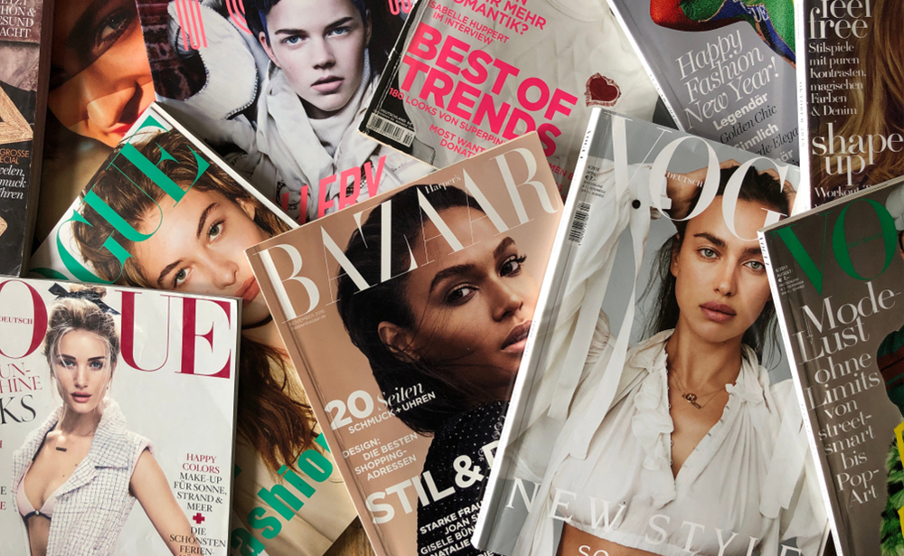
The cover of a magazine carries a heavy load. It must represent your brand, excite loyal subscribers, entice new readers, preview the enclosed content, and stand alone as a work of published art. Each cover comes with questions of color, font, space, and brand consistency. While many cover features change from one issue to the next, others remain consistent. With all this to consider, how do magazine publishers bring it all together to create fresh cover ideas?
Get to know your audience
Are you publishing a food magazine to provide recipes for midwestern grandmothers? An up-and-coming culture magazine covering all things Gen Z? Or an outdoor magazine designed to inspire sustainable living in tune with nature? Identifying your target audience helps you define the purpose of your publication, and whoever your intended audience, it is essential to tailor your magazine — and its cover — to attract their attention and keep them coming back for more.
A magazine’s cover is a potential reader’s first experience of your publication, so its design must attract and intrigue. To do both, you need a working knowledge of your target readers and the elements of cover style.
 Elements of cover design
When most magazine readers think of well-known publications, such as Time, The New Yorker, In Style, and National Geographic, it’s the covers that leave the most lasting impression. And while each cover differs in the details, several elements are present on every magazine cover. These include:
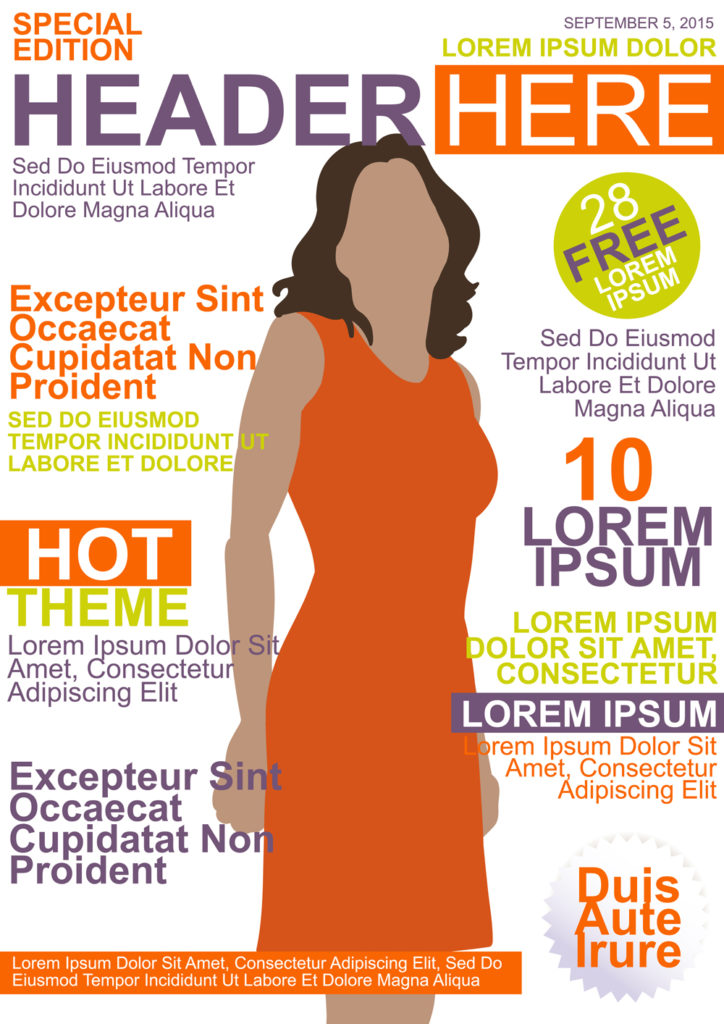
- A distinctive masthead. The masthead is the industry term for a magazine’s title. It should be big, bold, memorable, and easily recognizable. A unique masthead creates brand awareness and becomes a symbol of your publication and its values. The most successful magazines have their own unique and unforgettable mastheads with consistent fonts, font sizes, and placement across every issue.
- Issue designation and dateline. While not necessarily prominent, each cover should include the magazine’s volume number, issue number, and release date. Volume refers to the publication period, typically a year, while issue number refers to each issue’s place within the current volume. Datelines differ depending on the frequency of publication, so they may refer to a specific day, month, or season along with the year. All three of these elements are necessary for magazine cataloguing and citation purposes.
- Lead article title and supporting text. Display the title of your leading article prominently. You may also choose to include a line or two of teaser text or the titles of significant supporting articles. While the cover image is usually what catches a reader’s attention, article titles spark more interest and invite readers to peruse past the cover.
- Build your cover around a single primary image designed to appeal to your target reader, and create a clear relationship to your publication’s brand and the individual issue’s theme. Don’t shy away from innovation. Imagery can include hand-drawn or digital illustrations, photographs, abstract art, or a creative combination. The idea is to catch the reader’s eye and invite them to explore beyond the cover.
- Typography is an art form all its own. According to Neville Brody, Art Director for The Face from 1981 to 1986, “Every font itself has a number of levels of messaging, and there’s not only the textual content—the words being written—but also the choice of a typeface is usually influential on the way we think about words. The same word in a heavy, bold propaganda kind of typeface will feel completely different to if it’s in a kind of light serif italic.” Choose fonts that reflect and reinforce your magazine’s brand, message, and content.
- The masthead should always be in the same place, but the other elements can be arranged neatly around the cover image. Grids and layouts determine where each piece of text will go. You can change text color and article title placement to work with each issue’s primary image. The overall design should feel neat, professional, engaging, and consistent. Grid lines help organize and align each element of cover design.
Once you’ve nailed down your design, keep it consistent across issues. There is always room to get creative with your chosen design, so feel free to play and experiment within the grid. But as your most significant selling point, your cover should effectively establish your brand’s style to appeal to your target readers.
Contact your Sheridan representative or visit our contact page to ask how we can help you streamline your publishing processes, reduce costs, and keep up with changes in print and publishing strategies.
